
Recently, I had the pleasure of watching another webinar from Marketing Experiments about copywriting. I particularly enjoy their webinars for a variety of reasons – one, they’re based in my home state of Florida, so I’m always a sucker for supporting people in my local area.
Next, their presentation is always very engaging.
Best of all, they back their claims up with hard evidence of what works and what doesn’t. Combine data with their general expertise on landing page copy and value propositions and it’s hard for me to resist.
The latest webinar focused on 5 discoveries that help strengthen copy on a landing page. By landing page, I mean a page designed for conversion, be it a final sale, newsletter signup or whatever.
Before diving into the 5 discoveries though, host Austin McGraw takes a moment to reveal a foundational principle of developing a landing page, which is you have to match copy to your visitor’s thought sequences.
As marketers, we often get caught up in optimizing our pages’ layout or whether the call-to-action button should be green or blue. However, as Austin reminds us, our real job is to optimize thought sequences. Understanding your customers’ thought sequence really boils down to the basic structure of a story. Of course, the concept of story (exposition, rising action, climax, falling action and resolution) has been around long before the dawn of the Internet Age.
While I can certainly share in this blame, digital marketers too often dismiss foundational concepts like this. I hope to study this more in the months and years ahead as I continue my professional development.
In this vein, Marketing Experiments goes on to explain 5 proven discoveries on how you should be “mapping your copy to your customer’s thoughts.” As they show in the webinar, keeping the following 5 items in mind when writing your landing pages will help improve conversions, sometimes significantly.
#1 – You only have 7 seconds (…maybe less) to arrest the attention of your prospect
This is critical since there are so many things vying for our attention, especially online. If your page, more specifically your headline, doesn’t grab the visitor’s attention within a few seconds, you will lose them.
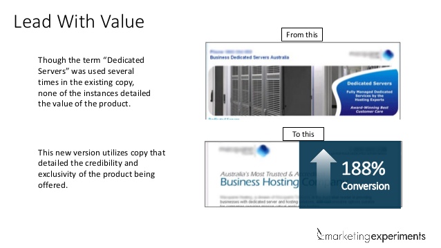
In their test example, the initial (a.k.a. control) headline was very bland. The same verbiage was used several times throughout the page.
In the revised page (a.k.a. treatment), the new headline provides more background on the credibility and “exclusivity” of the offer – as a result, the page saw a 188% higher conversion rate.
Instead of saying “Dedicated Servers,” the new headline provides more information to the visitor on why their solution is better than competitors.
#2 – Never present your solution before building the problem
No doubt you’re very excited about your product or service and eager to present your “solution.” However, if the visitor doesn’t understand the problem, they will be confused and leave the page. Therefore, you should never assume your customer understands the problem your product/service is intended to solve.
In their example, the control headline presents the solution upfront. However, what they didn’t do is help visitors ascertain if a blown automotive head gasket was in fact their problem.
The treatment’s header tries to answer a few questions upfront and provides more information on the signs and symptoms of this particular issue. They escalate the problem, address it and then provide a solution.
The key takeaway is this – never assume the problem, and never present your solution without building the problem first. How much space you devote to building the problem depends on how complex it is and the audience’s awareness of it.

#3 – Clarity trumps persuasion
This is probably the most important rule of any copy – be it a magazine, a blog post or a landing page. While it can be tempting to let your creative side come out, it shouldn’t come at the expense of making your copy as clear as possible. You should be absolutely clear about the value of your offer and not try to write some snappy headline that may sound good but makes no sense to your readers.
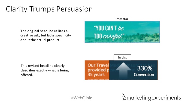
In the webinar’s example, the control’s headline sounds really snappy, but it provides absolutely no specifics on the actual product.
While the treatment headline doesn’t sound as sexy, it’s very clear on the offer – when comparing the two versions, the treatment received 330% more conversions!
#4 – Be ruthlessly unsentimental about your copy
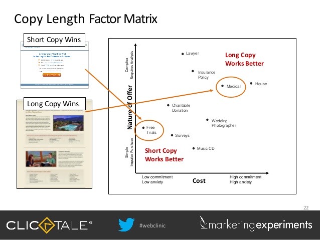
Another temptation for copywriters is to make their pages as long as possible. I guess it’s a mental block for most of us – if the page is short, it looks like we didn’t put much effort into it.
However, the length of your page should be dependent on the complexity of your offer. If your product/service doesn’t require much commitment, shorter copy is better while more complex offers will require longer copy – in other words, the length of your page should be sufficient enough to explain your product and express its value – nothing more, nothing less.
This gets into what Austin describes as friction – if you have unnecessary copy, you’re creating more friction and therefore scaring people off. On the other hand, if your offer is complex, expensive or emotional, you will need more copy to address the reader’s pain points and reduce friction. See this handy chart from Marketing Experiments, or check out a prior webinar from 2013 on Long vs. Short Copy.
#5 – Asks must align with expectations
The last discovery is one that many marketers, including myself, often fail at. The call-to-action (CTA) is a critical part of guiding the reader to take the final step.
The problem is that many CTAs are too pushy and don’t match where the customer’s thought sequences are. If the customer isn’t ready or isn’t expecting a “buy now” button, they will feel like you’re just rubbing your offer in their face.
Rather than “Get Started” or “Buy Now,” say “See How it Works” or something similar instead. However, it’s okay to say “Buy Now” provided the customer is at that point.
I know this example was discussed in a prior webinar – you wouldn’t walk up to a girl at a bar and say “let’s go back to my place” in the first minute would you? It’s the same concept here, except you’ll only be slapped figuratively and not literally.
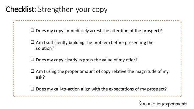
Once the webinar went through these 5 concepts, they wrapped things up with a short checklist you can use to ensure your pages are meeting all of these criteria.
While you have to consider design elements and other factors, your copy is by far the most important part of how you communicate your offer and its value, especially in relation to your competitors.
I strongly recommend watching the entire webinar, including their live optimization at the end where Austin and his co-host evaluate submissions and provide feedback on how the pages can be improved – my summary here doesn’t do it justice!
I would personally recommend any of the webinars from Marketing Experiments. I hope I can one day take their certification courses and possibly even visit their headquarters since they’re only about 2 hours from my home.
**All images courtesy of Marketing Experiments via Slideshare
Leave a Reply